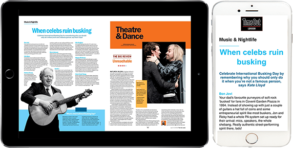
A frustration-free way of reading magazines and documents on smartphones

According to research firms such as Gartner, smartphones are now overwhelmingly the dominant device through which we consume content online.
Our PhoneView module is designed to empower magazine publishers to reach smartphone users in a way that bridges the gap between digital page-turning type content and responsive HTML/CSS.
PhoneView works through either PDF or XML workflows and sits alongside the existing Digital Edition of a magazine or other piece of digitally published content and allowing the user to switch between that "traditional" view and a responsive HTML/CSS view. Just to make things a bit easier on the reader, on smartphones, the magazine or document will default to the responsive PhoneView look.
This ability to seamlessly transition between replica-view and PhoneView gives the best of both worlds, the look and feel of the publication or document is maintained, but gone is the repetitive pinching and zooming.
PhoneView is first and foremost about enhancing the reading experience on smartphones and empowering the reader to choose whichever he or she feels more comfortable with - as a result, other options within PhoneView such as font size can also be adjusted by the reader.
Sentinel
Redemption Codes
Reflowable Mode
Applications